Monday 17 June 2013

Pros and Cons of Social Networking Sites

Social Networking sites are a regular part of our everyday lives.
They are hugely popular  amongst the current generations.
But there are major disagreements to wether sites such as Facebook, Twitter, Tumbler etc. are really a good thing. Or wether they are invasive and destroying what is known as society today.

There are many good points to social networking sites they are the fastest ways of spreading information to a large group of people. Whether it is to inform people of a major event or simply to tell them what you are up to at the moment.

Many people also use social networking sites to socialise. Making new friends and keeping in contact with the existing ones. It can also lead to face to face interactions between people. This can be seen as both an advantage and a disadvantage. Although it is a good reason to meet with people you know, it can also be a reason to meet with people you don't know who could potentially be very dangerous.

Social media sites are also good for business. Whether you are an established and accomplished company or just a small music group trying to get recognised, Sites such as Facebook and Twitter can be used for great advertisement and raising awareness purposes.


There are also negative points to social networking, for example the spread of rumours and false information. Many fights and disputes can be traced back to sites like Facebook. As soon as something is posted millions can know about it in seconds. And without any checks on the informations validity many people become miss informed and this often leads to conflicts.

There is also speculation about how much social networks are an invasion of a persons privacy and personal life. Many people feel that information can easily be gathered against them without them knowing. There are also numerous scams and advertisements on the site also designed to steal information and money etc. from the site users.


Dreamweaver

I experimented again with Dreamweaver and this time I was successfully able to make a fully functioning gallery.
The gallery can be viewed online.

Although all of the coding was correct within my dreamweaver project there was some kind of block on my computer that stopped me from publishing and viewing it online.

So I had to temporarily switch computers in order to view it working.


Sunday 16 June 2013

Online Website Makers

I decided to look into online website creators.
I saught out two:
 Wix.com and Moonfruit.

I had a little problem with moonfruit. Although both website creators were simple and easily accessible Moonfruit had a smaller selection of  templates that fitted to my theme.

So in the end I made a site using wix.

Template before editing:


Site During/After editing:

This was just a simple design but it does look like the basic design I wanted for my website.
There were three main pages to my site in the end.

My designers page, my home page and my gallery page.


Wednesday 12 June 2013

Feedback


After I had created my first four designs, I decided to gain a little feedback on them by posting them on the website deviantART and allowing people to comment on them.

Most of the feedback I received was very good.


"These are really awesome! ^_^ I'd soo love to wear them! ^_^"

"they all look awesome ,I especially like the third
"
etc.


There was however one person who didn't like the base I made to create the designs on, saying:


"im not much of a fan of the "popular" fashion look id would like them proportional and realistic so you can better see how it might look on you not some (not criticizing your work specifically) 12 foot anorexic"


I explained to them that the long body was to draw attention to the clothes, and that considering the project is based around popularity and fashion that going with the most common elements of a regular fashion base was my intent. As I stated in my previous blog posts.


All things considered, I feel that I gained fair and mostly positive feedback.


Sunday 2 June 2013

First Punk Designs

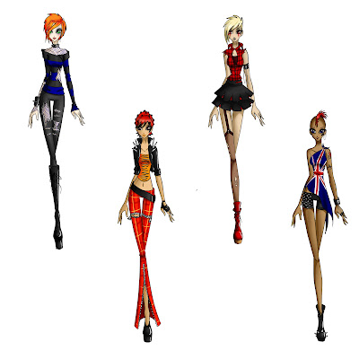
Using the fashion base I created in the past week I decided to start creating my punk inspired designs.
I made four different designs. The first falls more into the emo/punk genre than just punk. I also decided to edit the base to make models with corresponding hair style designs and tattoos etc to fit with the clothing designs.


Tuesday 28 May 2013

Making a Fashion Base

As I will be focusing mainly on the design side of fashion, I decided to create a fashion base. I looked around on the internet for inspiration and suggestions on how to make one. There was one main theme throughout the most popular ones I saw, and that was that they were tall, thin with elongated arms, legs and bodies.
The body and limbs are longer to draw attention to the clothing design.
This was my process in making my design base. From left to right. I will be using this base to create most of my punk designs on.